ST OSWALD’S HOSPICE. QUALITY TIME FOR EVERYONE.
St Oswald's Hospice delivers expert, dignified and compassionate care to babies, children, young people and adults with life limiting conditions.
The rebrand, as-well as being influenced by the mosaic made by patients on display in the main entrance, was massively inspired by the Hospice itself—the physical space inside and out, along with the excellent work they do in research, palliative care, and all they do for families and children with undiagnosed conditions, Syndromes Without A Name (SWANS).
Studies done at Chelsea and Westminster Hospital, on mental health and experiences of patients improving when visual art and certain colours were installed in patient spaces also informed the emblems illustrative style and brand colour palette.
Accessibility was key and guidelines were met throughout the making and production of the new identity.
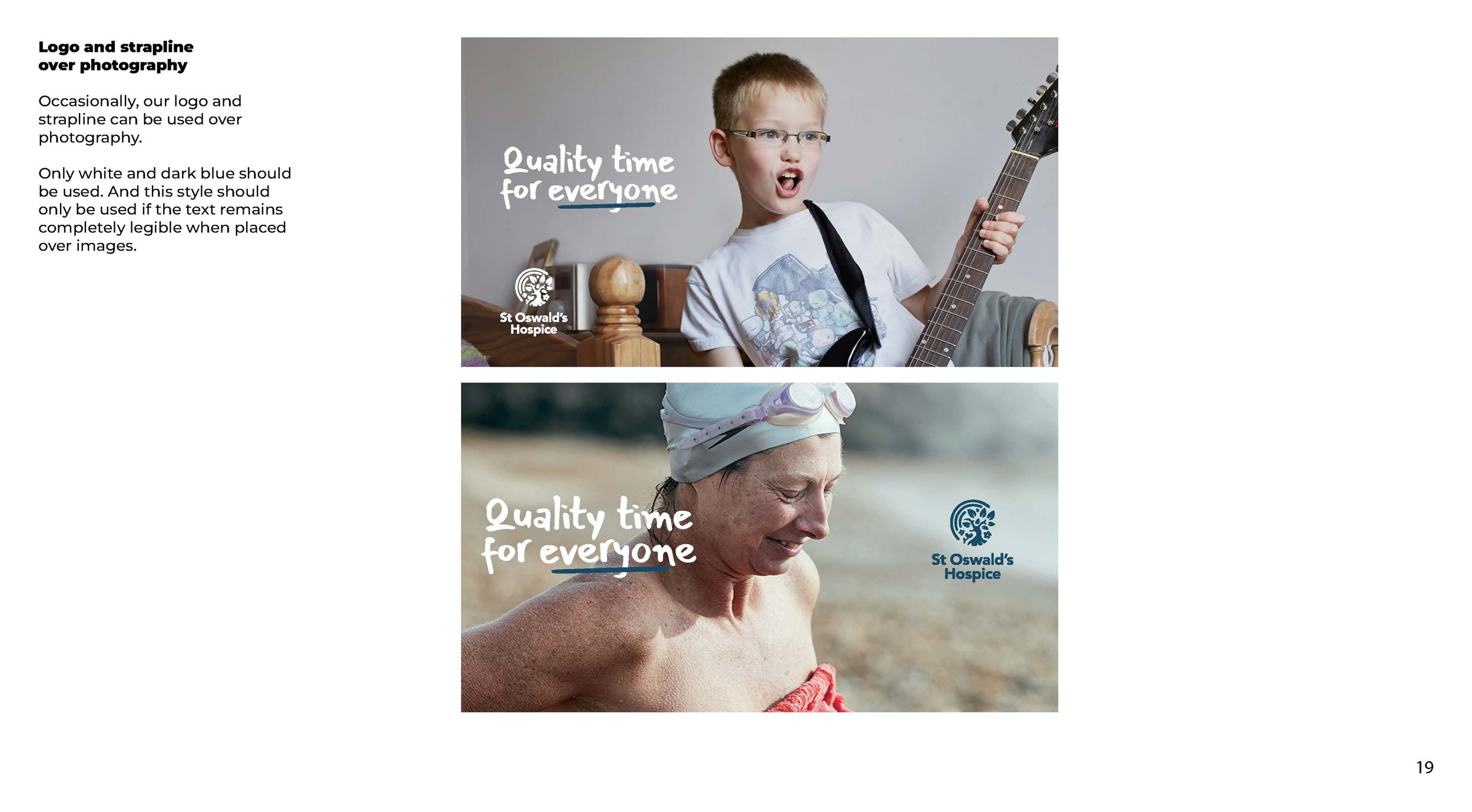
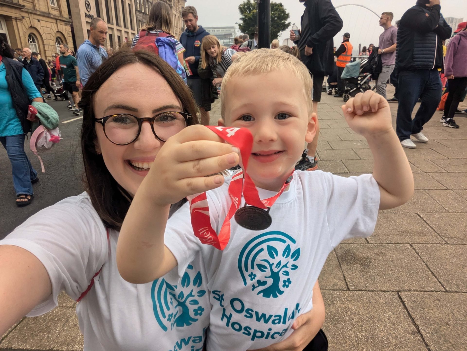
The extensive set of brand guidelines covered everything from hospice stationary, uniforms and transport livery to charity shop fronts and wayfinding.
Agency: Drummond Central
Creative, Brand Identity, Illustration & Graphic Design: Sam Laverick
Finalist: Brand Creation of the Year, North East Marketing Awards 2021


