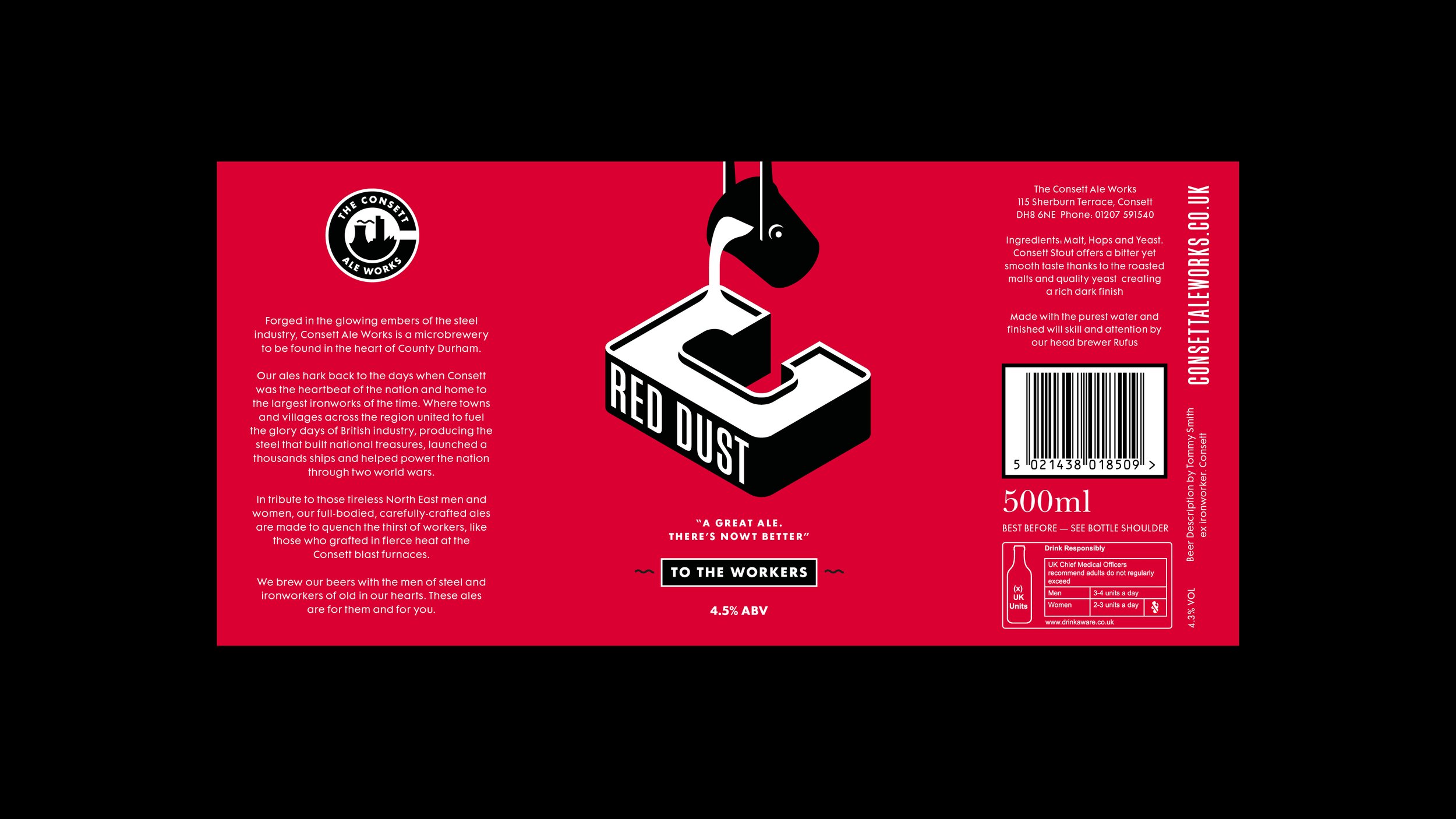
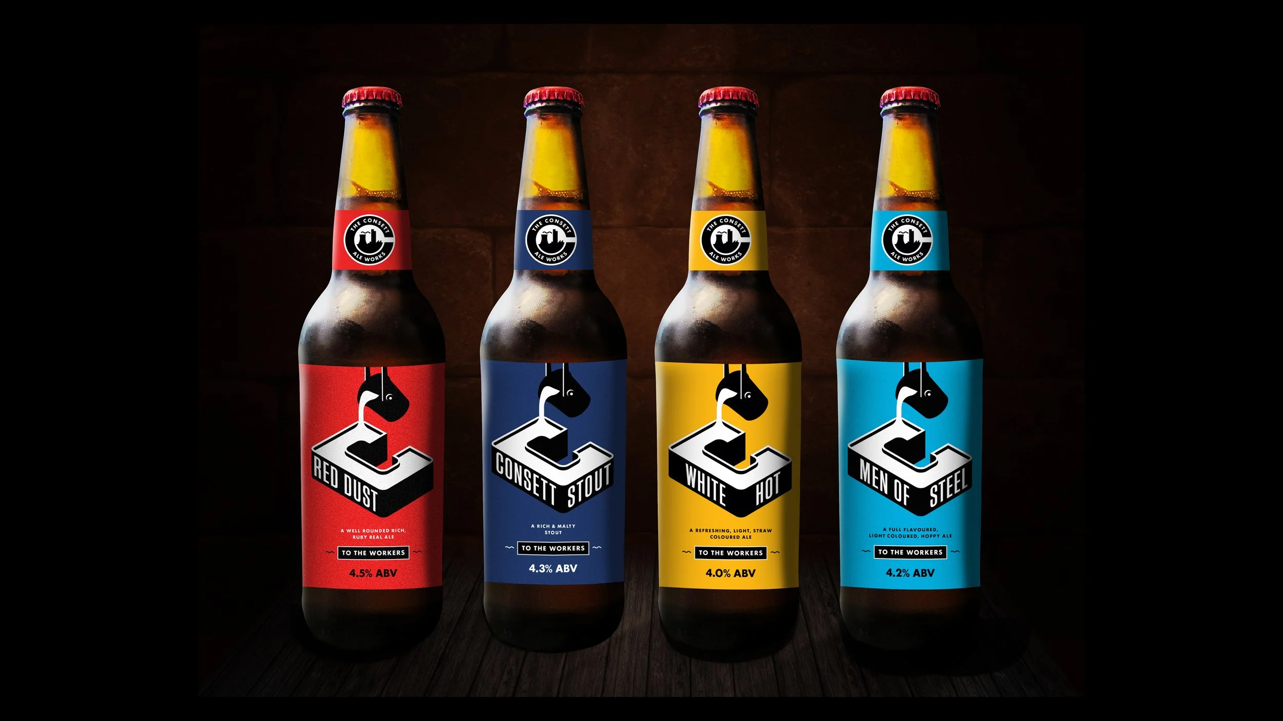
CONSETT ALE WORKS.
To the workers.
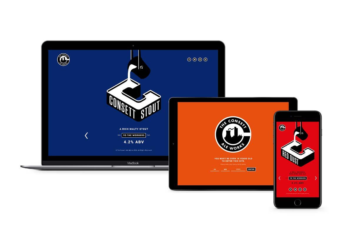
A full rebrand and packaging design for a brewery based in Consett on the Derwent River.
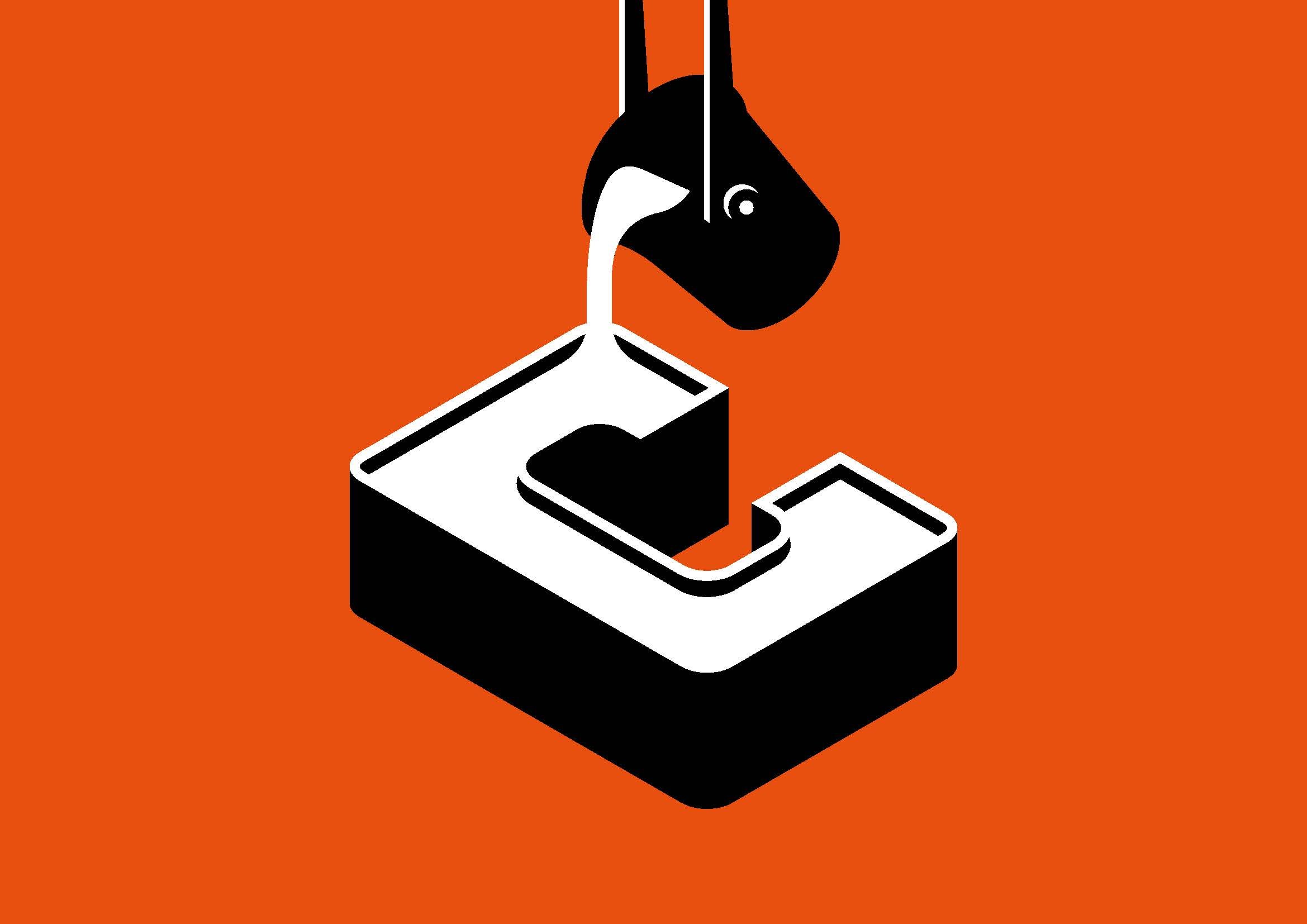
Inspired by the Iron Works logo. magazines, and posters from the 50’s/60’s, we wanted to create a new visual style that stayed true to the main idea, celebrating the industrial heritage of Consett’s Iron/Steel Works and area—remaining important to current customers and regional audiences—speaking directly to them, while at the same time create something that would appeal to the younger ‘Craft Ale Market’.
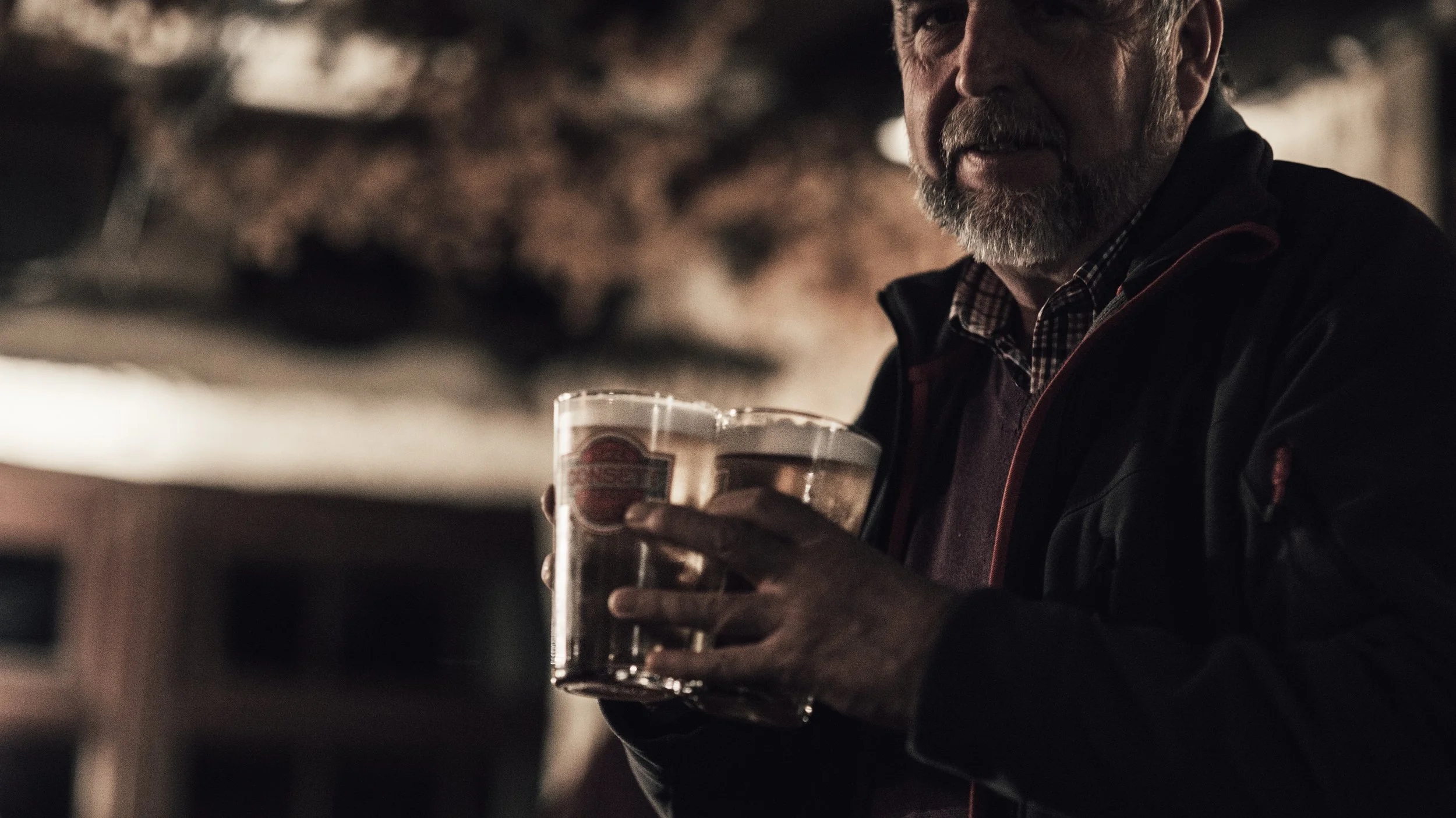
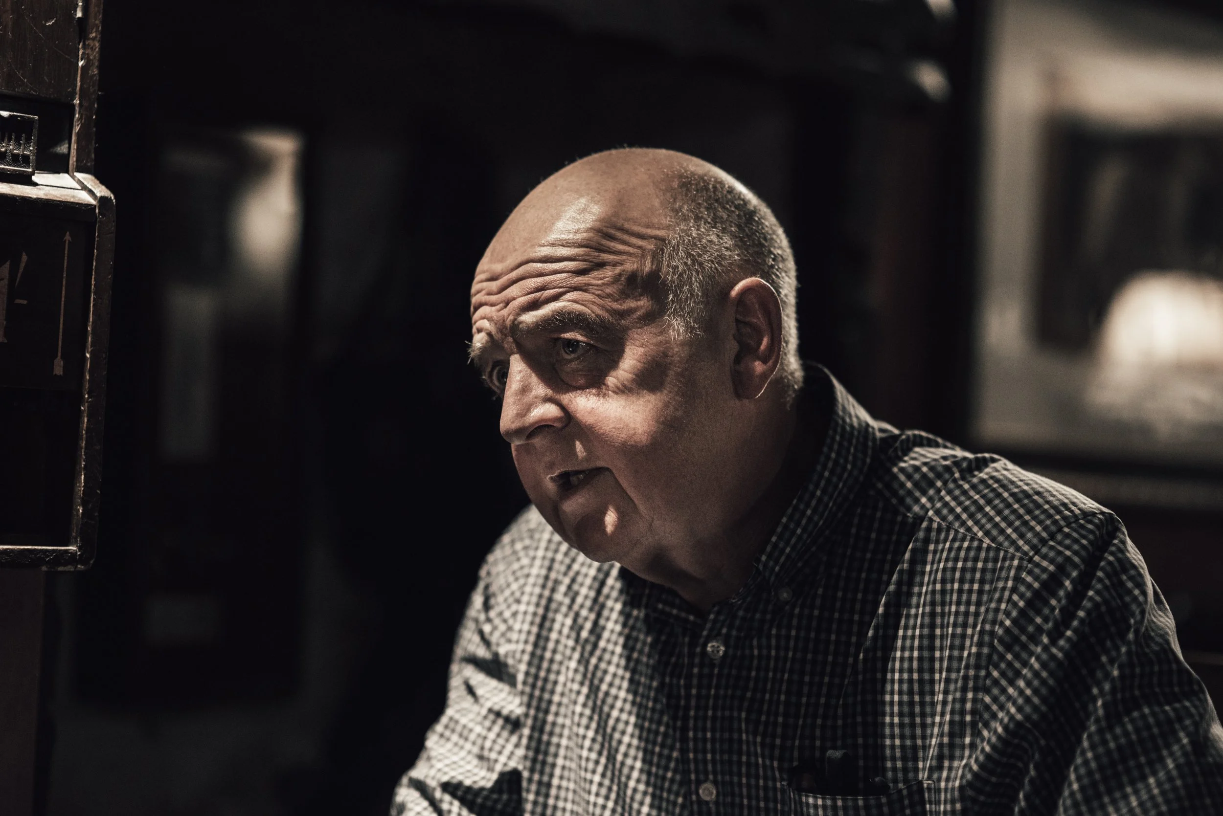
To launch the rebrand we held a get together of ex-steel workers from the Works at Consett—shooting this at the Grey Horse, a stones throw from the original grounds. Even though the short films/interviews we wanted to make didn’t work out, the photography’s amazing and the last portrait is of a lovely bloke who came up with his son, all the way from Hull.
Cross company at Concept a year or so later, I declared my love to Bob Olly after bumping into him in a pub and was over the moon when he agreed to create a new pub sign for the Grey Horse in front of the brewery—To say I ‘Art Directed’ Bob would be total bollocks—I was in awe and asked him to do whatever he wanted.
Agency: Keltie Cochrane
Creative, Art Direction, Brand Identity, Graphic Design: Sam Laverick
Creative & UX: The Mighty Andy Bell
Photography: Ryan Lilburn